nano banana proは、高品質な画像生成ができるAI画像生成モデルです。
でも、「思った通りの画像が生成されない」「プロンプトの書き方がわからない」と悩んでいる方も多いのではないでしょうか。
この記事では、nano banana proで理想の画像を生成するための実践的なプロンプトテクニックを紹介します。
バナー画像からリアルな人物写真、ロゴデザインまで、8つのカテゴリ別に効果的なプロンプト実例を掲載しています。
今日から使えるテクニックばかりなので、ぜひ参考にしてくださいね。
nano banana proで押さえるべき基本
JSON形式でプロンプトを作ることが効果的
nano banana proでは、通常のテキストプロンプトよりもJSON形式でプロンプトを構造化することが、より高精度な画像生成につながります。
JSON?なにそれ?
JSON形式とは、データを構造的に整理するための記述方法です。
プログラミングでよく使われる形式ですが、難しく考える必要はありません。
なぜJSON形式が効果的なのか
JSON形式が効果的な理由は、以下の3点です。
1. 情報が明確に分類される
通常のプロンプトは、すべての情報が一つの文章に混在します。一方、JSON形式では「被写体」「スタイル」「色」「構図」などの要素を明確に分けて指定できます。
これにより、AIが各要素を正確に理解し、意図した通りの画像を生成しやすくなります。
2. 優先順位が伝わりやすい
JSON形式では、要素の順序や階層構造で優先度を表現できます。最も重要な要素を上位に配置することで、AIがそれを重視して生成してくれます。
3. 修正・調整がしやすい
後から特定の要素だけを変更したいとき、JSON形式なら該当箇所だけを書き換えればOKです。プロンプト全体を書き直す必要がありません。
JSON形式プロンプトの基本構造
Copy{
  "subject": "何を描くか(被写体)",
  "style": "画風やスタイル",
  "composition": "構図やレイアウト",
  "colors": "色調や配色",
  "lighting": "ライティング",
  "mood": "雰囲気や感情",
  "details": "細部の指定"
}
この基本構造を押さえておけば、どんな画像にも応用できます。
それでは、実際のカテゴリ別プロンプト実例を見ていきましょう。
1. バナー画像のプロンプトテクニック
バナー画像で重要なポイント
バナー画像は、視認性とメッセージ性が重要です。以下の点を意識しましょう。
- テキストスペースの確保
- 視線誘導を意識した構図
- ブランドカラーとの調和
- 情報の優先順位
また、バナー画像内に入れたい文字列は、text_contentなどとして独立して書いてあげるといいです。
実例1:セールバナー
{
  "subject": "modern e-commerce sale banner design",
  "style": "clean, professional, gradient background",
  "composition": "horizontal layout, left side main text area, right side sub-text area",
  "colors": "vibrant red to orange gradient, white accents",
  "elements": "abstract geometric shapes, subtle shadow effects",
  "text_content": {
    "main_text": "当店限定",
    "sub_text": "5月23日23:59まで",
    "text_style": "bold sans-serif Japanese font, white color with shadow",
    "text_position": "main text on left side, deadline on bottom right"
  },
  "text_space": "left 40% area clear for main text, bottom right corner for deadline",
  "mood": "energetic, urgent, attractive"
}ポイント テキストを配置するスペースを明示的に指定することで、文字が読みやすいバナーが生成されます。
実例2:ブログヘッダー画像
{
  "subject": "tech blog header background design",
  "style": "minimalist, modern, abstract",
  "composition": "wide panoramic view, center area clear for title text",
  "colors": "deep blue, cyan, white, dark background",
  "elements": "floating digital particles on edges, circuit board patterns on sides, blur effects",
  "text_content": {
    "main_text": "バイブコーディングで個人開発をするブログ",
    "text_style": "modern sans-serif Japanese font, white or cyan color with glow effect",
    "text_position": "centered horizontally, middle of image"
  },
  "text_space": "center 50% horizontal area clear and empty for text overlay",
  "layout": "visual elements concentrated on left and right edges, center space open",
  "mood": "futuristic, professional, innovative",
  "lighting": "soft glow, neon accents from sides",
  "note": "generate background only, Japanese text will be added in post-production"
}
ポイント ブログのジャンルに合わせた抽象的な表現を使うことで、汎用性の高いヘッダーが作れます。
実例3:SNS投稿用バナー
{
  "subject": "Instagram post background for lifestyle brand",
  "style": "warm, organic, natural aesthetic",
  "composition": "square format, rule of thirds, upper portion clear for text",
  "colors": "earth tones, beige, soft pink, cream white",
  "elements": "dried flowers in bottom portion, natural textures, soft shadows",
  "text_content": {
    "main_text": "新生活を彩る",
    "sub_text": "ナチュラルな暮らしのヒント",
    "text_style": "elegant Japanese serif or handwriting style font, dark brown color",
    "text_position": "main text in upper center, sub text below main text"
  },
  "text_space": "top 40% completely clear and empty for text overlay",
  "layout": "visual interest in lower 60%, clean minimalist space above",
  "mood": "calm, elegant, sophisticated",
  "aspect_ratio": "1:1",
  "note": "generate background only, Japanese text will be added in post-production"
}
ポイント SNSの投稿サイズ(1:1や9:16など)を明示することで、プラットフォームに最適化された画像が生成されます。
2. リアルな日本人女性のプロンプトテクニック
リアルな人物生成で重要なポイント
人物画像は、不自然さが目立ちやすいため、細部の指定が重要です。
- 年齢層を明確に
- 表情や感情を具体的に
- 服装やシーンの詳細指定
- 照明や背景のリアリティ
実例1:プロフィール写真風
{
  "subject": "professional Japanese woman portrait",
  "age": "late 20s",
  "appearance": "natural makeup, soft smile, shoulder-length straight black hair, friendly eyes",
  "clothing": "white business shirt, simple accessories",
  "composition": "head and shoulders, slightly turned to camera, eye contact",
  "background": "soft blurred office environment, natural window light",
  "lighting": "soft natural light from left, professional photography lighting",
  "mood": "confident, approachable, professional",
  "style": "photorealistic, high resolution, corporate photography"
}
ポイント ビジネスシーンでは、清潔感と親しみやすさのバランスが重要です。照明を「natural window light」と指定することで、自然な仕上がりになります。
実例2:カジュアルなライフスタイル写真
{
  "subject": "young Japanese woman enjoying coffee at cafe",
  "age": "mid 20s",
  "appearance": "casual makeup, relaxed expression, long brown hair in ponytail, warm smile",
  "clothing": "beige knit sweater, minimal jewelry",
  "composition": "candid shot, sitting by window, holding coffee cup, 3/4 angle",
  "background": "cozy cafe interior, wooden table, soft bokeh",
  "lighting": "warm afternoon sunlight through window, golden hour glow",
  "mood": "relaxed, happy, peaceful",
  "style": "lifestyle photography, natural, authentic, film camera aesthetic"
}
ポイント 「candid shot」と指定することで、自然な瞬間を切り取ったような雰囲気が出ます。
実例3:アクティブなシーン
{
  "subject": "Japanese woman jogging in urban park",
  "age": "early 30s",
  "appearance": "athletic build, ponytail, focused expression, light sweat glow",
  "clothing": "sporty running outfit, fitness wear, running shoes, smartwatch",
  "composition": "dynamic motion shot, running towards camera, shallow depth of field",
  "background": "morning park with trees, urban skyline in distance, jogging path",
  "lighting": "early morning natural light, fresh and crisp",
  "mood": "energetic, healthy, determined",
  "style": "sports photography, action shot, photorealistic"
}
ポイント 動きのあるシーンでは「dynamic motion shot」と指定し、背景にボケを入れることで躍動感が出ます。
3. 動物のプロンプトテクニック
動物画像で重要なポイント
動物の特徴を正確に捉え、感情や行動を表現することが大切です。
- 種類と品種の明確化
- 表情や仕草の指定
- 環境や背景のリアリティ
実例1:ペット風の犬
{
  "subject": "adorable Shiba Inu puppy",
  "appearance": "fluffy cream-colored fur, round black eyes, small pointed ears, cute expression",
  "action": "sitting and tilting head curiously",
  "composition": "close-up portrait, eye level, centered",
  "background": "soft blurred home interior, warm lighting",
  "lighting": "natural soft light, gentle shadows",
  "mood": "cute, playful, innocent",
  "style": "pet photography, high detail, photorealistic"
}
ポイント 「tilting head curiously」のような具体的な仕草を指定すると、愛らしさが増します。
実例2:野生動物のダイナミックな瞬間
{
  "subject": "majestic eagle in flight",
  "appearance": "detailed feathers, sharp yellow eyes, powerful wingspan fully extended",
  "action": "soaring through sky, wings spread wide, hunting pose",
  "composition": "dramatic low angle shot, bird against sky",
  "background": "mountain peaks, dramatic cloudy sky, sunset colors",
  "lighting": "golden hour backlight, rim lighting on feathers",
  "mood": "powerful, free, majestic",
  "style": "wildlife photography, National Geographic style, cinematic"
}
ポイント 「National Geographic style」と指定することで、プロの野生動物写真のような仕上がりになります。
実例3:水族館風の魚
{
  "subject": "colorful tropical fish swimming",
  "appearance": "vibrant blue and yellow scales, flowing fins, detailed textures",
  "action": "gracefully swimming among coral",
  "composition": "underwater perspective, fish in foreground, clear focus",
  "background": "coral reef, aquatic plants, turquoise water, light rays",
  "lighting": "sunlight filtering through water, god rays, underwater caustics",
  "mood": "peaceful, mysterious, beautiful",
  "style": "underwater photography, vivid colors, crystal clear"
}
ポイント 「underwater caustics」(水面の光の揺らぎ)を指定すると、水中のリアリティが格段に上がります。
4. インフォグラフィックのプロンプトテクニック
インフォグラフィックで重要なポイント
情報の整理と視覚的なわかりやすさが最優先です。
- 階層構造の明確化
- アイコンやグラフの配置
- 色分けによる情報整理
- 読みやすさの確保
実例1:ビジネスプロセス図
{
  "subject": "business process infographic",
  "layout": "horizontal flow chart, left to right progression, 5 steps",
  "elements": "numbered circles, connecting arrows, icon for each step, text boxes",
  "style": "modern, clean, professional, flat design",
  "colors": "corporate blue gradient, white background, orange accents for highlights",
  "composition": "balanced spacing, clear hierarchy, ample white space",
  "details": "simple line icons, drop shadows for depth, clear separation between sections"
}
ポイント 「ample white space」を指定することで、情報が詰まりすぎず読みやすくなります。
実例2:データ比較インフォグラフィック
{
  "subject": "data comparison infographic",
  "layout": "vertical layout, divided into 3 columns, comparison table format",
  "elements": "bar charts, percentage indicators, checkmarks and crosses, statistics numbers",
  "style": "minimalist, data visualization, modern",
  "colors": "teal and coral contrast, neutral gray background, white cards",
  "composition": "grid-based layout, aligned elements, visual hierarchy",
  "details": "subtle gradients, rounded corners, consistent spacing, readable typography areas"
}
ポイント 対比を強調したい場合は、コントラストの強い色の組み合わせ(teal and coral)を指定します。
実例3:タイムラインインフォグラフィック
{
  "subject": "timeline infographic",
  "layout": "vertical zigzag timeline, alternating left and right content boxes",
  "elements": "central timeline line, milestone markers, date labels, content cards",
  "style": "creative, modern, storytelling visual",
  "colors": "purple to blue gradient line, white content boxes, pastel accents",
  "composition": "balanced alternating layout, connected flow, clear progression",
  "details": "milestone icons, connector lines, subtle shadows for dimension"
}
ポイント タイムラインは「zigzag」や「serpentine」などの形状を指定すると、視覚的に面白くなります。
5. ロゴデザインのプロンプトテクニック
ロゴデザインで重要なポイント
シンプルさ、視認性、スケーラビリティが重要です。
- コンセプトの明確化
- シンボルやモチーフの選定
- 色数の制限
- 可読性の確保
実例1:テックスタートアップ向けロゴ
{
  "subject": "modern tech startup logo",
  "concept": "innovation, connection, growth",
  "symbol": "abstract geometric shape, interconnected nodes, forward arrow element",
  "style": "minimal, contemporary, bold, scalable",
  "colors": "vibrant blue and electric cyan, gradient option",
  "composition": "centered symbol with wordmark below, balanced proportions",
  "typography": "sans-serif, modern, clean, geometric font style",
  "details": "simple lines, no complex details, works in monochrome"
}
ポイント 「works in monochrome」と指定することで、様々な用途に使えるシンプルなロゴになります。
実例2:カフェ・飲食店向けロゴ
{
  "subject": "cozy cafe logo design",
  "concept": "warmth, community, artisan quality",
  "symbol": "stylized coffee cup with steam, or coffee bean illustration",
  "style": "hand-drawn feel, organic, friendly, vintage touch",
  "colors": "warm brown, cream, earthy tones, maximum 2-3 colors",
  "composition": "circular badge layout, or horizontal lockup with illustration",
  "typography": "serif or script font suggestion, handcrafted feel",
  "details": "retro elements, stamp-like quality, rustic texture hints"
}
ポイント 飲食店ロゴは「hand-drawn feel」や「artisan quality」を入れることで、温かみが出ます。
実例3:フィットネスブランド向けロゴ
{
  "subject": "fitness brand logo",
  "concept": "strength, energy, transformation",
  "symbol": "dynamic human figure in motion, or abstract muscle/power symbol",
  "style": "bold, athletic, energetic, powerful",
  "colors": "strong red and black, or orange and dark gray, high contrast",
  "composition": "strong horizontal layout, symbol and text integrated",
  "typography": "bold sans-serif, uppercase, condensed or extended width",
  "details": "sharp angles, motion lines, solid shapes, masculine or unisex appeal"
}
ポイント 「sharp angles」や「motion lines」でダイナミックさを表現できます。
6. イラスト・キャラクターのプロンプトテクニック
イラストで重要なポイント
画風の統一感と、キャラクターの個性表現が大切です。
- イラストスタイルの明確化
- キャラクターの特徴
- 色使いとテイスト
実例1:アニメ風キャラクター
{
  "subject": "anime-style original character",
  "appearance": "teenage girl, large expressive eyes, colorful hair with twin tails",
  "clothing": "school uniform with unique accessories, ribbons, detailed outfit",
  "style": "modern anime illustration, cel shading, vibrant colors",
  "composition": "full body standing pose, dynamic angle, white or simple background",
  "colors": "pastel color palette, pink and blue accents, bright and cheerful",
  "details": "clean linework, highlight in eyes, flowing hair, anime proportions",
  "mood": "cheerful, energetic, cute"
}
ポイント 「cel shading」を指定することで、アニメ特有の塗りが再現されます。
実例2:絵本風イラスト
{
  "subject": "children's book illustration",
  "appearance": "friendly animal characters, simple and appealing designs",
  "style": "soft watercolor style, gentle and warm, storybook aesthetic",
  "composition": "scene with multiple characters, storytelling moment",
  "colors": "soft pastel colors, warm tones, harmonious palette",
  "details": "textured paper effect, soft edges, hand-painted feel, gentle lighting",
  "mood": "innocent, heartwarming, magical"
}
ポイント 「watercolor style」と「textured paper effect」で、手描き絵本のような温かみが出ます。
実例3:キャラクターアイコン
{
  "subject": "mascot character icon",
  "appearance": "cute round animal or creature, simple features, big eyes",
  "style": "flat design, vector illustration style, kawaii aesthetic",
  "composition": "centered, circular frame, front-facing",
  "colors": "bright primary colors, simple 3-4 color palette, high contrast",
  "details": "bold outlines, minimal shading, symmetrical design, scalable",
  "mood": "friendly, approachable, playful"
}
ポイント アイコン用途では「scalable」「symmetrical」を指定して、小さくしても見やすいデザインに。
7. 風景・背景画像のプロンプトテクニック
風景画像で重要なポイント
時間帯、天候、季節感が雰囲気を大きく左右します。
- 時間帯と光の表現
- 天候と季節
- 構図と奥行き
実例1:日本の四季を感じる風景
{
  "subject": "Japanese autumn landscape with temple",
  "scene": "traditional temple with red torii gate, surrounded by maple trees",
  "season": "autumn, peak fall foliage",
  "composition": "path leading to temple, rule of thirds, depth with foreground and background",
  "colors": "vibrant red and orange leaves, warm golden tones, traditional red temple",
  "lighting": "soft afternoon light, gentle shadows, warm glow",
  "atmosphere": "peaceful, serene, nostalgic",
  "style": "photorealistic, landscape photography, vivid colors"
}
ポイント 日本らしさは「traditional temple」「torii gate」など具体的な要素で表現します。
実例2:ファンタジー風景
{
  "subject": "fantasy landscape with floating islands",
  "scene": "massive floating islands in sky, waterfalls cascading down, ancient ruins",
  "composition": "epic wide shot, multiple layers of depth, dramatic perspective",
  "colors": "ethereal blues and purples, glowing magical elements, sunset sky",
  "lighting": "dramatic god rays, magical glow, volumetric lighting",
  "atmosphere": "magical, mysterious, awe-inspiring",
  "style": "digital painting, concept art, highly detailed",
  "details": "clouds below islands, flying creatures, crystal formations"
}
ポイント 「volumetric lighting」「god rays」で幻想的な光の表現ができます。
実例3:都市の夜景
{
  "subject": "modern city night skyline",
  "scene": "urban skyscrapers, illuminated buildings, busy streets below",
  "time": "night, blue hour twilight",
  "composition": "elevated viewpoint, panoramic wide shot, city sprawl",
  "colors": "deep blue night sky, warm yellow building lights, neon accents",
  "lighting": "artificial city lights, light trails from cars, reflections",
  "atmosphere": "vibrant, energetic, urban",
  "style": "long exposure photography, sharp details, high dynamic range",
  "details": "light reflections on glass, bokeh from distant lights, clear sky or light clouds"
}
ポイント 「blue hour」は夕暮れ直後の美しい青い時間帯を指す写真用語です。この指定で幻想的な夜景になります。
8. プロダクト・商品写真のプロンプトテクニック
商品写真で重要なポイント
商品の魅力を最大限に引き出すライティングと構図が重要です。
- 商品の質感表現
- 背景とのバランス
- 光の当て方
実例1:化粧品の商品写真
{
  "subject": "luxury skincare product photography",
  "product": "elegant glass bottle with pump dispenser, minimalist label",
  "composition": "centered product, slight angle, hero shot with shadows",
  "background": "clean white or soft beige backdrop, marble surface",
  "lighting": "soft studio lighting, subtle rim light, gentle shadows for depth",
  "props": "minimal botanical elements, water droplets on bottle for freshness",
  "style": "commercial product photography, high-end, editorial quality",
  "mood": "elegant, pure, sophisticated",
  "details": "sharp focus on product, bokeh background, reflections on surface"
}
ポイント 「water droplets」「botanical elements」など、商品の特性を強調する小道具を加えます。
実例2:食品・料理写真
{
  "subject": "gourmet food photography",
  "product": "artisan burger with layers visible, fresh ingredients",
  "composition": "close-up shot, 45-degree angle, shallow depth of field",
  "background": "rustic wooden table, blurred cafe environment",
  "lighting": "natural window light from side, warm and appetizing",
  "props": "scattered ingredients, sauce drips, casual placement",
  "style": "food photography, editorial style, mouthwatering",
  "mood": "delicious, appetizing, fresh",
  "details": "texture details, steam if hot food, glistening surfaces, garnish"
}
ポイント 食べ物は「45-degree angle」が最も美味しそうに見える角度です。
実例3:テクノロジー製品
{
  "subject": "modern tech gadget product shot",
  "product": "sleek wireless earbuds with charging case, matte black finish",
  "composition": "floating product arrangement, isometric or 3/4 view",
  "background": "gradient background, dark to light, or pure black with spotlight",
  "lighting": "dramatic studio lighting, edge lighting to show form, subtle reflections",
  "props": "minimal, perhaps floating geometric shapes for modern feel",
  "style": "commercial tech photography, Apple-style product shot, premium",
  "mood": "sophisticated, high-tech, premium",
  "details": "sharp product focus, subtle texture on surfaces, LED indicators glowing"
}
ポイント 「Apple-style product shot」と指定すると、洗練されたテックプロダクトの雰囲気が出ます。
プロンプト作成の共通テクニック
最後に、どのカテゴリにも共通する実践的なテクニックをまとめます。
テクニック1:具体的な数値を使う
「大きい」ではなく「3メートルの高さ」、「明るい」ではなく「F1.8の明るさ」のように、具体的な数値を使うと精度が上がります。
テクニック2:写真用語を活用する
「shallow depth of field」「bokeh」「golden hour」「rule of thirds」など、写真撮影の専門用語を使うと、プロフェッショナルな仕上がりになります。
テクニック3:参照スタイルを明示する
「National Geographic style」「Apple product photography」「Studio Ghibli aesthetic」のように、有名なスタイルを参照すると、イメージが伝わりやすくなります。
テクニック4:ネガティブプロンプトも活用する
望まない要素は「avoid」「without」「no」を使って明示しましょう。
例:「no watermark, no text, no blur, avoid oversaturation」
テクニック5:段階的に調整する
最初から完璧を目指さず、ベースとなるプロンプトを作り、生成結果を見ながら要素を追加・削除していく方が効率的です。
まとめ
nano banana proで理想の画像を生成するためのプロンプトテクニックを、8つのカテゴリ別に紹介しました。
重要なポイントをおさらいします。
- JSON形式での構造化が高精度生成の鍵
- カテゴリごとに押さえるべきポイントが異なる
- 具体的な数値や専門用語の活用が効果的
- 参照スタイルの明示で意図が伝わりやすくなる
最初は難しく感じるかもしれませんが、この記事のプロンプト実例をベースに、自分の用途に合わせてカスタマイズしていくのがおすすめです。
何度か試していくうちに、自分なりのコツがつかめてきますよ。ぜひ実践してみてくださいね。
イメージ通りに画像生成できると楽しいよね!
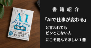
▼nano banana をもっと詳しく学びたい方向けのおすすめ書籍はこちら▼